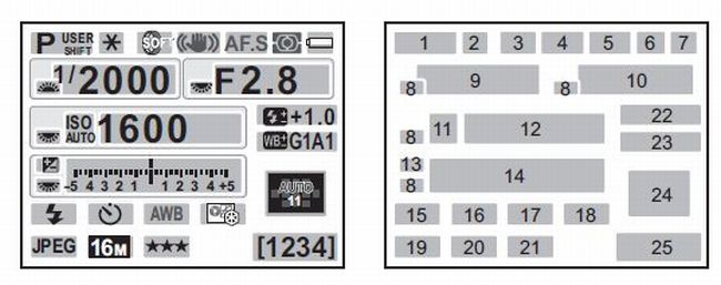
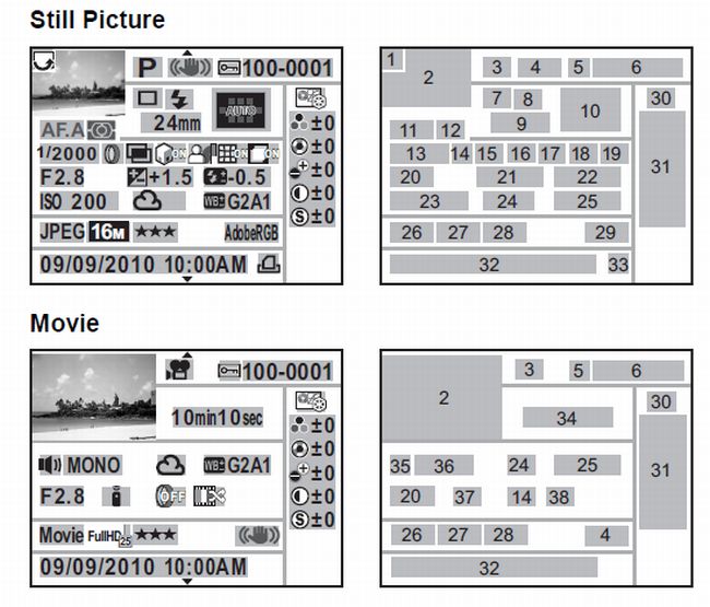
Too much information for such a small screen
When faced with new (and challenging) technology, try reading the manual. When faced with insomnia, the same advice applies. Early this morning, long before the dawn of a new day, I found myself loading the user manual for our camera onto the Playbook, the better to read in bed without turning on any extra lights.
I’m “old school” when it comes to photography. I understand the basics of exposure, and the idea of setting the ASA, metering the situation and then making an educated choice of aperture and shutter speed is clear. But now I’m in the strange parallel universe implied by a digital camera. I have to read to do. Too many tiny, fidgety settings.
Probably, the camera can do the job on its own. Give it a stable footing, start the meter running and come back later for perfectly exposed and focused shots, devoid of human error (other than that induced by a programmer, far away from here). Yes, the camera does have a totally “auto” mode, but I want to move beyond that. I want to know about the little warning lights that blink on and off in the viewfinder.


Not exactly “point and shoot”. More akin to the HUD (heads up display) on a futuristic fighter plane, as seen through a keyhole. After all, the viewfinder is exactly the same size as it was on my trusty Spotmatic II, where a waving needle was all that I needed. As the kids say, TMI (too much information).
I’ve been playing with the sibling of the new camera for about five years now. The display is similar. I haven’t mastered it, either. Until now, I haven’t tried curing my insomnia by a session of RTFM.


